Before anyone registers, books a flight, or reads the agenda, they land on your website. And in just a few seconds, they’ve already decided what kind of event it is. Worth their time or not.
So, if you’re planning an important event, the design had better show it. Here are a few cool event website ideas to try for your next one.
Diving into these event websites reveals a mix of approaches, from heartfelt pulls to sleek professionalism. Each of these draws on distinct elements to engage, but they all prioritize clarity and relevance. Let's break them down, highlighting what clicks for different event vibes.
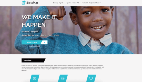
1. Blessings Charity Event
Right away, Blessings pulls at the heart with its hero image—a child beaming confidence, fist pumped high—paired with "We Make It Happen" in stark white text. The Liverpool fundraiser dates sit front and center, urging immediate event registration via a teal button that pops against the minimal backdrop.
As you scroll, icons distill the cause into bites like "Better Future," backed by stats on volunteers and donations over a tender photo. Sponsors and speakers follow in grids, building trust without excess, while boxed details seal the deal. The real hook is how it weaves emotion through visuals, turning a simple page into a call for compassion that event planners can mirror to rally support for causes.
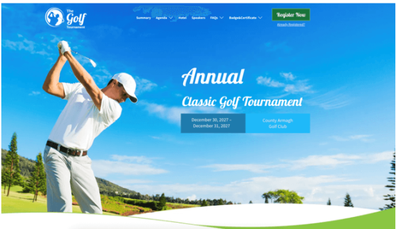
2. Annual Classic Golf Tournament
Golf tournaments thrive on that open-air excitement, and this event landing page nails it with a sweeping hero of a player swinging under endless blue skies, the tournament name curving like a fairway. Dates and location tag along, with a registration button in green. The button’s color stands out against the blue backdrop.
A countdown overlays a grassy field, pulling you into the theme, before speakers and sponsors like Nike line up cleanly. What elevates it is the subtle immersion—curved lines and sporty icons make browsing feel like a leisurely round, a tactic planners can use to evoke the event's energy early and hook recreational crowds.
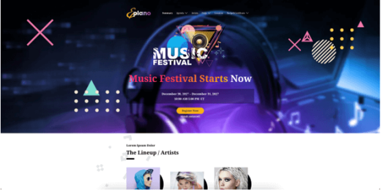
3. TRAP Music Festival
For something bolder, TRAP's page erupts in purple neon, triangles and crosses scattering like beats, with the festival name dominating and a yellow button screaming to register. Artist lineups grid out in record-like frames, vibrant portraits drawing eyes, while a podcast section offers downloads amid anniversary recaps with crowd shots pulsing with life.
Schedule blocks stack dynamically, ending in action-oriented detail cards. This site's energy stems from its abstract flair, mirroring the Trap's rhythm—music gig planners can steal this by layering colors and media to create lingering buzz.
4. LTEN Leadership Conference
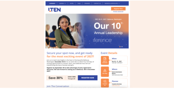
Shifting to a professional setting, LTEN is a great conference website example. It opens with a conference room scene, attendees focused and diverse, the 10th annual title bold in orange. It pitches the Bellevue event as transformative, flashing early bird savings and social links to spark FOMO.
Speakers pop in bio-linked cards, partners like Microsoft underscore prestige, and details flow in intuitive boxes. The balance of motivation and practicality shines here, showing planners how incentives woven into a clean layout can turn leadership forums into must-attend gatherings.
5. International Seminar 2027
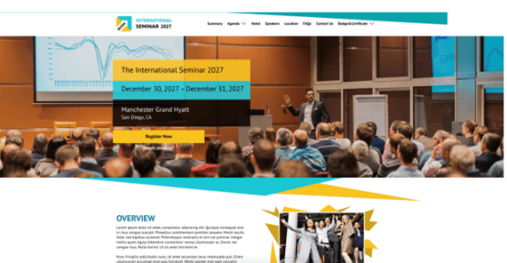
Seminars demand focus, and this one delivers with angled teal banners over a speaker mid-presentation, January San Diego dates locked in yellow.
Overview text slants into inspiring day icons, a gallery collage teases past energy, and testimonials angle in for proof. Speakers frame up with context, details tilting toward contact.
The geometric push creates momentum, guiding users through dense info— a smart move for educational planners to keep complex agendas feeling alive and navigable.
6. IBC 2027 Brewery Event
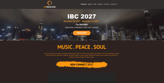
Night falls on this brewery-themed page, city lights reflecting the "Music. Peace. Soul." ethos, an orange register button cutting through the dark. An embedded video from a past panel adds immediacy, speakers circling in gold, details columned for quick grabs.
Its understated urban mood pairs video with theme to make change feel attainable, offering planners a way to ground abstract concepts in real footage for deeper connections.
7. Palm Springs Photo Festival
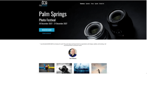
Photography calls for visuals first, and Palm Springs answers with a dark hero of lenses gleaming, dates etched below a blue button. A grid explodes with captioned shots—symmetrical chilies, thunderbird levels—showcasing craft, presenters rowed, sponsors under lights like exhibits.
The countdown and stage-overlay details amp the expo feel. By letting images dominate, it immerses users in creativity, a blueprint for creative planners to preview the magic and entice visual thinkers.
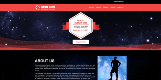
8. SPIN CON Annual Summit
Stars blanket SPIN CON's hero, a red badge pinning summit details, registration white against the cosmos. About Us text pairs with a peak silhouette for inspiration, a single keynote spotlighted in red, and countdown circles ticking urgency.
This cosmic minimalism fuels ambition with restraint—planners of similar summits can use thematic backdrops to spotlight key draws without dilution.
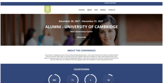
9. Alumni University of Cambridge Conference
Alumni events tap into nostalgia, and this page does so with a classroom hero, books, and faces that evoke Cambridge halls, with a blue-registered button centered. The about section lays out the gathering's purpose in straightforward text, drawing on shared history to reconnect former students.
Countdown blues lead to sponsors over library photo from Joyride Cycle to Flagship Group, blending corporate support with academic roots for added relevance. Speakers get headshots in a row, and green cards handle logistics.
It rebuilds community through familiar scenes, a gentle nudge for planners planning educational events like seminars and reunions to lean on heritage imagery for that pull-back effect, ensuring the design resonates with those who value tradition and networks.
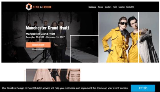
10. Style & Fashion Reunion Event
Fashion demands sleekness, and this site serves it with split heroes—venue left, models striding right in yellow—orange button poised. Overview text hugs a runway shot, setting the stage for what's ahead without excess words, while keynote speakers align horizontally to highlight industry voices.
Sponsors logoed simply, skyline backing location adds an urban edge that ties into the event's chic vibe. Details line up crisply at the end. The glamour shines in balanced visuals and space, guiding fashion planners to reflect elegance that draws style-savvy registrants, where minimal copy lets the imagery do the heavy lifting in building allure.
These examples showcase themes you can adapt directly through Cvent’s Visual Showcase—pick one that fits your vision, and our event website builder team will handle the design to create a responsive site tailored to your needs.
What makes a good event page?
Strong event pages stem from understanding how people interact online. Let's unpack the essentials, drawing from real-world pitfalls and wins to help you sidestep common traps.
Clear navigation and structure
Visitors hit your site with questions in mind, so answer them fast: put dates, locations, and agendas where eyes naturally land first. This keeps them from bouncing off in frustration and creates a smooth path that feels intuitive rather than forced. Sections like speakers or FAQs stack logically below, so users can jump straight to important details without endless hunting.
Compelling visuals and design
First glances count hugely—studies show people form opinions on visual appeal in just 50 milliseconds. Choose images and colors that reflect the spirit of your event, and keep fonts consistent to avoid distraction.
When visuals align with the theme, they pull people deeper, turning a quick look into genuine interest. High-resolution photos or subtle animations can add polish, as long as they load quickly and support the overall message.
Mobile responsiveness
Over 64% of web traffic now flows through mobile devices, so your page needs to flex without breaking. Buttons stay tappable, text scales up, and layouts shift smoothly, ensuring no one walks away because of a clunky experience on their phone. Testing on various screen sizes catches issues early, like oversized images or misplaced elements that could frustrate handheld users.
Engaging content and clear calls to action
Keep the copy sharp and benefit-focused. Highlight what attendees gain, such as fresh insights or connections, to spark that "I need this" feeling. Place action buttons strategically, repeating them without being overly repetitive, so signing up feels like the natural next step.
Personal stories or quick quotes from past participants can add relatability and draw visitors in while reinforcing the event's value.
An easy registration process
Streamline the signup: integrate forms that load quickly, offer perks like tiered pricing, and confirm instantly. Reducing hurdles here means more completions, as folks hate jumping through hoops when excitement peaks. Options for guest logins or saved preferences speed things along, turning potential drop-offs into confirmed spots.
Strong event branding
Branding ties everything together, giving your event a recognizable identity that builds trust across touchpoints. Cvent streamlines this with event website templates you can tweak for logos and palettes, while Splash handles coordinated invites and pages to maintain that polish. Both let planners focus on the big picture, ensuring the site feels like part of a unified story. Consistent elements, from taglines to icons, reinforce recall, helping attendees associate the event with quality from the first visit.
Design successful event websites
Looking back at these sites, one truth stands out: the best ones don't just list facts, they evoke the event's essence, making visitors feel the pull before they even arrive. Whether it's Blessings' emotional core or TRAP's vibrant pulse, success comes from matching design to purpose. Grab a Cvent template that resonates, layer in your details, and test it live. Your audience is waiting--give them a reason to show up.

